Gobiz: Improving Merchant Feedback Collection Experiences
Gobiz: Improving Merchant Feedback Collection Experiences
Mobile Design
|
UX Designer
|
September 2022
Understanding the Product Context
Understanding the Product Context
Understanding the Product Context
🏪 About Gobiz
🏪 About Gobiz
🏪 About Gobiz
GoBiz is a merchant-focused platform within the Gojek ecosystem that helps business owners manage operational activities, promotional campaigns, and business performance through integrated digital tools.
GoBiz is a merchant-focused platform within the Gojek ecosystem that helps business owners manage operational activities, promotional campaigns, and business performance through integrated digital tools.
GoBiz is a merchant-focused platform within the Gojek ecosystem that helps business owners manage operational activities, promotional campaigns, and business performance through integrated digital tools.
🥺 Why This Feature Was Needed
🥺 Why This Feature Was Needed
🥺 Why This Feature Was Needed
Following a major visual update to the GoBiz application, the project aimed to understand how merchants responded to the new experience and identify potential usability issues through structured feedback collection.
Following a major visual update to the GoBiz application, the project aimed to understand how merchants responded to the new experience and identify potential usability issues through structured feedback collection.
Following a major visual update to the GoBiz application, the project aimed to understand how merchants responded to the new experience and identify potential usability issues through structured feedback collection.
🎉 Introducing the “Feedback Loop” Interaction
🎉 Introducing the “Feedback Loop” Interaction
🎉 Introducing the “Feedback Loop” Interaction
The “Feedback Loop” was designed as a lightweight feedback interaction that encourages merchants to share their responses after experiencing the updated interface. The interaction begins with a simple reaction prompt, followed by more structured follow-up questions tailored to the user’s selected response.
The “Feedback Loop” was designed as a lightweight feedback interaction that encourages merchants to share their responses after experiencing the updated interface. The interaction begins with a simple reaction prompt, followed by more structured follow-up questions tailored to the user’s selected response.
The “Feedback Loop” was designed as a lightweight feedback interaction that encourages merchants to share their responses after experiencing the updated interface. The interaction begins with a simple reaction prompt, followed by more structured follow-up questions tailored to the user’s selected response.
Encouraging Feedback Without Disrupting Users
Encouraging Feedback Without Disrupting Users
Encouraging Feedback Without Disrupting Users
Problem Statement
Problem Statement
Problem Statement
How might we design a feedback interaction that encourages participation without disrupting the merchant experience?
How might we design a feedback interaction that encourages participation without disrupting the merchant experience?
How might we design a feedback interaction that encourages participation without disrupting the merchant experience?
To guide the design decisions for this feature, I focused on two key considerations throughout the process:
To guide the design decisions for this feature, I focused on two key considerations throughout the process:
To guide the design decisions for this feature, I focused on two key considerations throughout the process:
🎨 Behavioural Design Principle
🎨 Behavioural Design Principle
🎨 Behavioural Design Principle
Understanding user behavior helped determine how the feedback interaction should appear, how frequently it should surface, and where it should be positioned to increase visibility without creating excessive interruption.
Understanding user behavior helped determine how the feedback interaction should appear, how frequently it should surface, and where it should be positioned to increase visibility without creating excessive interruption.
Understanding user behavior helped determine how the feedback interaction should appear, how frequently it should surface, and where it should be positioned to increase visibility without creating excessive interruption.
🗣️ Consistency & Familiar Interaction Pattern
🗣️ Consistency & Familiar Interaction Pattern
🗣️ Consistency & Familiar Interaction Pattern
To maintain consistency with the existing Gojek ecosystem, the interaction was designed using familiar design patterns and UI components aligned with the latest design system guidelines.
To maintain consistency with the existing Gojek ecosystem, the interaction was designed using familiar design patterns and UI components aligned with the latest design system guidelines.
To maintain consistency with the existing Gojek ecosystem, the interaction was designed using familiar design patterns and UI components aligned with the latest design system guidelines.
Designing a More Effective Feedback Interaction
Designing a More Effective Feedback Interaction
Designing a More Effective Feedback Interaction
The design is created based on several design choices informed by the fundamental principles of this project.
The design is created based on several design choices informed by the fundamental principles of this project.
The design is created based on several design choices informed by the fundamental principles of this project.
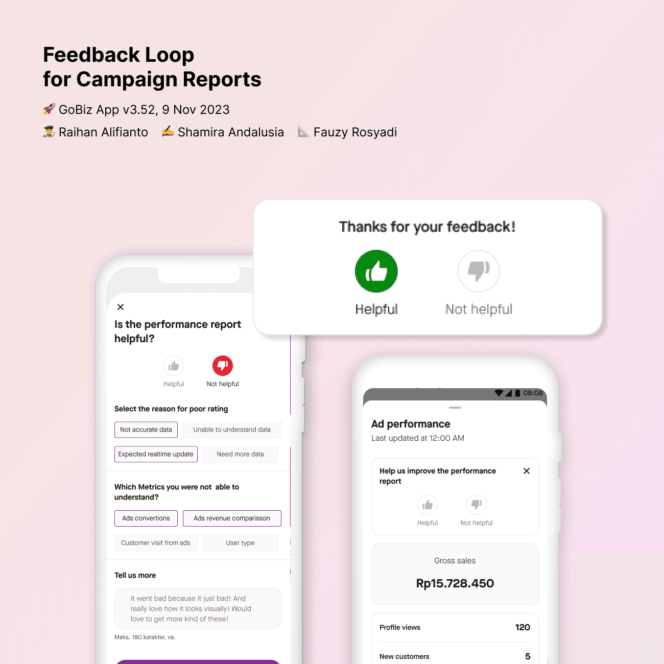
The feedback loop appears at the top of the advertisement performance section the first time a merchant accesses a campaign after the update. Merchants can choose to dismiss the survey, and the frequency of the prompt gradually decreases to reduce interruption and avoid survey fatigue throughout the campaign lifecycle.
The feedback loop appears at the top of the advertisement performance section the first time a merchant accesses a campaign after the update. Merchants can choose to dismiss the survey, and the frequency of the prompt gradually decreases to reduce interruption and avoid survey fatigue throughout the campaign lifecycle.
The feedback loop appears at the top of the advertisement performance section the first time a merchant accesses a campaign after the update. Merchants can choose to dismiss the survey, and the frequency of the prompt gradually decreases to reduce interruption and avoid survey fatigue throughout the campaign lifecycle.
The interaction placement and recurrence strategy were informed by behavioral design principles and visibility prioritization. Positioning the feedback loop near the top of the page increases discoverability, while repeated but controlled exposure helps encourage participation without overly disrupting the merchant experience.
The interaction placement and recurrence strategy were informed by behavioral design principles and visibility prioritization. Positioning the feedback loop near the top of the page increases discoverability, while repeated but controlled exposure helps encourage participation without overly disrupting the merchant experience.
The interaction placement and recurrence strategy were informed by behavioral design principles and visibility prioritization. Positioning the feedback loop near the top of the page increases discoverability, while repeated but controlled exposure helps encourage participation without overly disrupting the merchant experience.

To improve feedback quality, the interaction guides merchants through structured response flows based on their selected reactions. Predefined categories help merchants provide clearer and more actionable feedback, while optional written comments allow additional context without making the interaction feel complicated.
To improve feedback quality, the interaction guides merchants through structured response flows based on their selected reactions. Predefined categories help merchants provide clearer and more actionable feedback, while optional written comments allow additional context without making the interaction feel complicated.
To improve feedback quality, the interaction guides merchants through structured response flows based on their selected reactions. Predefined categories help merchants provide clearer and more actionable feedback, while optional written comments allow additional context without making the interaction feel complicated.


After submitting feedback, merchants receive immediate confirmation through success or error notifications displayed at the top of the page. This interaction follows the Visibility of System Status principle from Nielsen’s 10 Usability Heuristics, helping users clearly understand whether their feedback has been submitted successfully.
After submitting feedback, merchants receive immediate confirmation through success or error notifications displayed at the top of the page. This interaction follows the Visibility of System Status principle from Nielsen’s 10 Usability Heuristics, helping users clearly understand whether their feedback has been submitted successfully.
After submitting feedback, merchants receive immediate confirmation through success or error notifications displayed at the top of the page. This interaction follows the Visibility of System Status principle from Nielsen’s 10 Usability Heuristics, helping users clearly understand whether their feedback has been submitted successfully.

What This Project Revealed
What This Project Revealed
What This Project Revealed
The feedback interaction successfully supported the project’s primary goal of collecting merchant responses after the campaign update. More than 2200 feedback submissions were collected, with approximately 60% of merchants expressing positive responses toward the updated experience and reporting no major usability concerns during the interaction.
The feedback interaction successfully supported the project’s primary goal of collecting merchant responses after the campaign update. More than 2200 feedback submissions were collected, with approximately 60% of merchants expressing positive responses toward the updated experience and reporting no major usability concerns during the interaction.
The feedback interaction successfully supported the project’s primary goal of collecting merchant responses after the campaign update. More than 2200 feedback submissions were collected, with approximately 60% of merchants expressing positive responses toward the updated experience and reporting no major usability concerns during the interaction.
What I Learned About Operational UX
What I Learned About Operational UX
What I Learned About Operational UX
This project helped me better understand that operational UX is not only about improving usability for users, but also about supporting business goals and helping teams gather more meaningful insights. It also showed me how design decisions can evolve depending on operational needs, product priorities, and the quality of user feedback collected throughout the experience.
This project helped me better understand that operational UX is not only about improving usability for users, but also about supporting business goals and helping teams gather more meaningful insights. It also showed me how design decisions can evolve depending on operational needs, product priorities, and the quality of user feedback collected throughout the experience.
This project helped me better understand that operational UX is not only about improving usability for users, but also about supporting business goals and helping teams gather more meaningful insights. It also showed me how design decisions can evolve depending on operational needs, product priorities, and the quality of user feedback collected throughout the experience.
What Could Be Improved Further
What Could Be Improved Further
What Could Be Improved Further
Further analysis revealed that many negative responses were not directed toward the feedback interaction itself, but rather toward frustrations with the campaign system and operational experience. Based on these findings, the next iteration would focus on refining the feedback structure, improving communication clarity, and creating more targeted questions to better separate design-related feedback from broader operational complaints.
Further analysis revealed that many negative responses were not directed toward the feedback interaction itself, but rather toward frustrations with the campaign system and operational experience. Based on these findings, the next iteration would focus on refining the feedback structure, improving communication clarity, and creating more targeted questions to better separate design-related feedback from broader operational complaints.
Further analysis revealed that many negative responses were not directed toward the feedback interaction itself, but rather toward frustrations with the campaign system and operational experience. Based on these findings, the next iteration would focus on refining the feedback structure, improving communication clarity, and creating more targeted questions to better separate design-related feedback from broader operational complaints.
Another Design Shot


Another Design Shot
Another Design Shot