Gigscapes: Designing Trust During High-Demand Ticket Sales
Gigscapes: Designing Trust During High-Demand Ticket Sales
Gigscapes: Designing Trust During High-Demand Ticket Sales
Mobile Design
|
UX Designer
|
July 2024

Understanding the Chaos Behind Ticket Sales
Understanding the Chaos Behind Ticket Sales
Understanding the Chaos Behind Ticket Sales
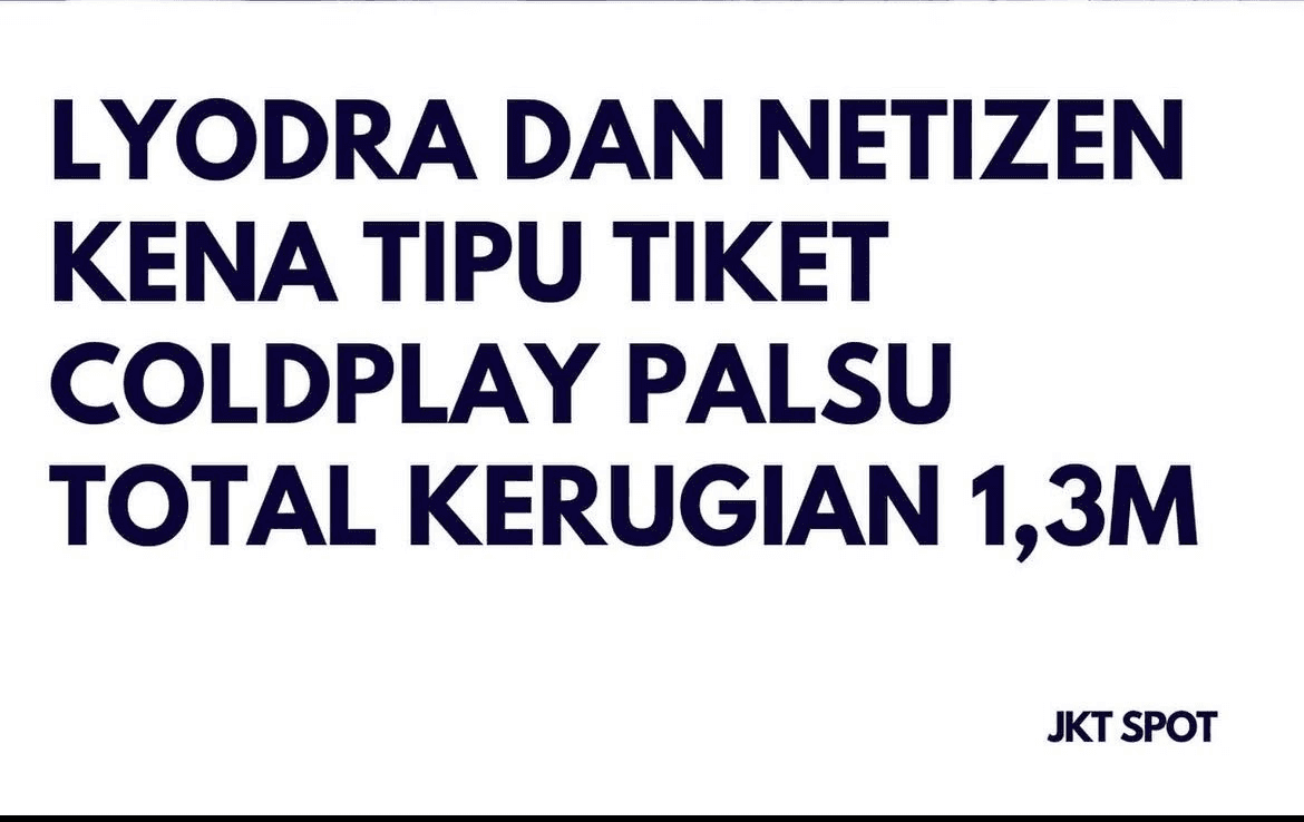
Have you ever heard about this?
Have you ever heard about this?
Have you ever heard about this?

What Happened?
What Happened?
What Happened?
High-demand ticket sales often feel chaotic. During Coldplay's ticket sales in Indonesia, fans faced scalpers, confusing queues, failed transactions, and uncertainty around ticket availability.
High-demand ticket sales often feel chaotic. During Coldplay's ticket sales in Indonesia, fans faced scalpers, confusing queues, failed transactions, and uncertainty around ticket availability.
High-demand ticket sales often feel chaotic. During Coldplay's ticket sales in Indonesia, fans faced scalpers, confusing queues, failed transactions, and uncertainty around ticket availability.
Personal Trigger
Personal Trigger
Personal Trigger
Having experienced the chaos firsthand, I wanted to understand what was actually causing the frustration, not just assume it was a technical issue
Having experienced the chaos firsthand, I wanted to understand what was actually causing the frustration, not just assume it was a technical issue
Having experienced the chaos firsthand, I wanted to understand what was actually causing the frustration, not just assume it was a technical issue
At first, I assumed the chaos was mainly caused by high traffic and server overload.
But I wasn't sure whether technical limitations alone explained why users felt so frustrated and distrustful during ticket sales. So I decided to look beyond the technical issue and understand what users actually experienced.
At first, I assumed the chaos was mainly caused by high traffic and server overload.
But I wasn't sure whether technical limitations alone explained why users felt so frustrated and distrustful during ticket sales. So I decided to look beyond the technical issue and understand what users actually experienced.
At first, I assumed the chaos was mainly caused by high traffic and server overload.
But I wasn't sure whether technical limitations alone explained why users felt so frustrated and distrustful during ticket sales. So I decided to look beyond the technical issue and understand what users actually experienced.
What Users Experienced During Ticket Sales
What Users Experienced During Ticket Sales
What Users Experienced During Ticket Sales
I conducted interviews with users who had previous experience purchasing concert tickets to better understand their frustrations, expectations, and behaviors during ticket sales.
The goal was to identify recurring pain points and discover features that could create a more seamless and trustworthy ticketing experience.
I conducted interviews with users who had previous experience purchasing concert tickets to better understand their frustrations, expectations, and behaviors during ticket sales.
The goal was to identify recurring pain points and discover features that could create a more seamless and trustworthy ticketing experience.
I conducted interviews with users who had previous experience purchasing concert tickets to better understand their frustrations, expectations, and behaviors during ticket sales.
The goal was to identify recurring pain points and discover features that could create a more seamless and trustworthy ticketing experience.
🎤 In-depth Interview
🎤 In-depth Interview
🎤 In-depth Interview
📱 Competitor Analysis
📱 Competitor Analysis
What I heard from ticket buyers
What I heard from ticket buyers
What I heard from ticket buyers
👩
What I disliked most was how little information was provided during checkout. I had to go back to the previous page just to cross-check my ticket details.
What I disliked most was how little information was provided during checkout. I had to go back to the previous page just to cross-check my ticket details.
What I disliked most was how little information was provided during checkout. I had to go back to the previous page just to cross-check my ticket details.
— Respondent 1
— Respondent 1
👩
The queue system itself works well, but I think it's important to know that the queue is based on when you entered. I want to know who gets priority and why.
The queue system itself works well, but I think it's important to know that the queue is based on when you entered. I want to know who gets priority and why.
The queue system itself works well, but I think it's important to know that the queue is based on when you entered. I want to know who gets priority and why.
— Respondent 4
— Respondent 4
What I learned
What I learned
What I learned
1️⃣ Lack of Reassurance (Users need clear confirmation that their ticket details and purchase are secured).
1️⃣ Lack of Reassurance (Users need clear confirmation that their ticket details and purchase are secured).
1️⃣ Lack of Reassurance (Users need clear confirmation that their ticket details and purchase are secured).
2️⃣ Lack of Visibility (Users need to understand what's happening and how the queue works).
2️⃣ Lack of Visibility (Users need to understand what's happening and how the queue works).
2️⃣ Lack of Visibility (Users need to understand what's happening and how the queue works).
Looking Beyond the User
Looking Beyond the User
Looking Beyond the User
To understand whether these frustration were isolated experiences or part of a broader ticketing problem, I also looked at how existing platform handle high-demand sales.
To understand whether these frustration were isolated experiences or part of a broader ticketing problem, I also looked at how existing platform handle high-demand sales.
To understand whether these frustration were isolated experiences or part of a broader ticketing problem, I also looked at how existing platform handle high-demand sales.
Platform
Platform
Platform
Observation
Observation
Observation
Tiket.com
Tiket.com
Tiket.com
Limited visibility around ticketing process
Limited visibility around ticketing process
Limited visibility around ticketing process
Loket
Loket
Loket
Queue experience doesn't clearly communicate progress
Queue experience doesn't clearly communicate progress
Queue experience doesn't clearly communicate progress
MPL.ID Tiketing
MPL.ID Tiketing
MPL.ID Tiketing
Lack of clear payment confirmation
Lack of clear payment confirmation
Lack of clear payment confirmation
TIX.ID
TIX.ID
TIX.ID
More informative ticket selection experience
More informative ticket selection experience
More informative ticket selection experience
Core Insight✨
Core Insight✨
Core Insight✨
When users lose visibility during a high-pressure purchase, uncertainty quickly turns into distrust.
When users lose visibility during a high-pressure purchase, uncertainty quickly turns into distrust.
When users lose visibility during a high-pressure purchase, uncertainty quickly turns into distrust.
Exploring Solutions Through UX Strategy
Exploring Solutions Through UX Strategy
Exploring Solutions Through UX Strategy
So, what's the real challenge??
So, what's the real challenge??
So, what's the real challenge??
How might we create a ticket purchasing experience that maintains clarity, trust, and user confidence during high-demand concert sales?
How might we create a ticket purchasing experience that maintains clarity, trust, and user confidence during high-demand concert sales?
How might we create a ticket purchasing experience that maintains clarity, trust, and user confidence during high-demand concert sales?

What did the research reveal?
What did the research reveal?
What did the research reveal?
🔍 Uncertainty create panic
Users were unsure whether their queue was progressing, their selected seat was reserved, or their payment had gone through. At these critical moment, a lack of feedback caused anxiety and encouraged behaviours such as refreshing repeatedly or opening multiple tabs.
🔍 Uncertainty create panic
Users were unsure whether their queue was progressing, their selected seat was reserved, or their payment had gone through. At these critical moment, a lack of feedback caused anxiety and encouraged behaviours such as refreshing repeatedly or opening multiple tabs.
🔍 Uncertainty create panic
Users were unsure whether their queue was progressing, their selected seat was reserved, or their payment had gone through. At these critical moment, a lack of feedback caused anxiety and encouraged behaviours such as refreshing repeatedly or opening multiple tabs.
⚠️ Perceived unfairness weakens trust
Scalping was frustrating not only because tickets became unavailable, but because users felt the platform did not adequately fair access and ticket ownership.
⚠️ Perceived unfairness weakens trust
Scalping was frustrating not only because tickets became unavailable, but because users felt the platform did not adequately fair access and ticket ownership.
⚠️ Perceived unfairness weakens trust
Scalping was frustrating not only because tickets became unavailable, but because users felt the platform did not adequately fair access and ticket ownership.
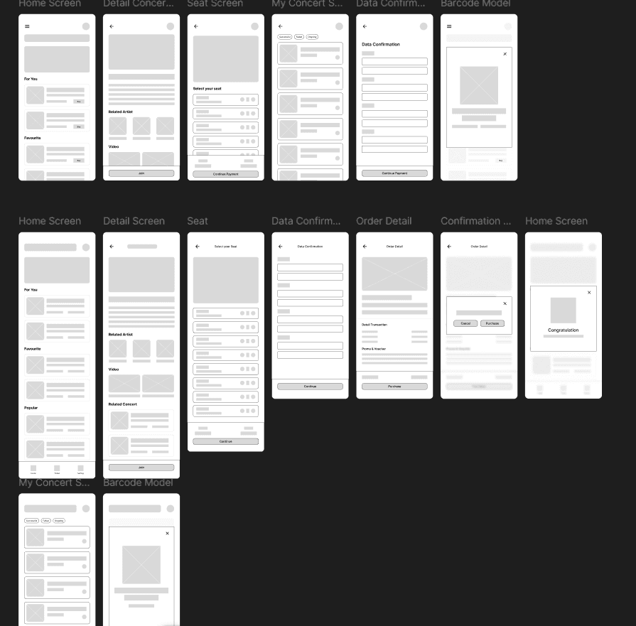
I translated the prioritized opportunities into low-fidelity concepts, focusing on three critical moments: joining queue, confirming a seat, and accessing the ticket after purchase.
I translated the prioritized opportunities into low-fidelity concepts, focusing on three critical moments: joining queue, confirming a seat, and accessing the ticket after purchase.
I translated the prioritized opportunities into low-fidelity concepts, focusing on three critical moments: joining queue, confirming a seat, and accessing the ticket after purchase.


I then turned the prioritized concept into a clickable wireframe to test whether users could understand the new reassurance and ticket protection mechanism without adding friction to the purchasing flow.
I then turned the prioritized concept into a clickable wireframe to test whether users could understand the new reassurance and ticket protection mechanism without adding friction to the purchasing flow.
I then turned the prioritized concept into a clickable wireframe to test whether users could understand the new reassurance and ticket protection mechanism without adding friction to the purchasing flow.
Usability Study 🧪
Usability Study 🧪
Usability Study 🧪
I tested the core purchasing flow with users to identify friction before moving into high-fidelity design.
I tested the core purchasing flow with users to identify friction before moving into high-fidelity design.
I tested the core purchasing flow with users to identify friction before moving into high-fidelity design.
Key Findings 🔎
Key Findings 🔎
Key Findings 🔎
🌟 Positive Feedback
Most participants found the overall application flow intuitive and familiar compared to other ticketing platforms, making the booking experience relatively easy to understand and navigate.
🌟 Positive Feedback
Most participants found the overall application flow intuitive and familiar compared to other ticketing platforms, making the booking experience relatively easy to understand and navigate.
🌟 Positive Feedback
Most participants found the overall application flow intuitive and familiar compared to other ticketing platforms, making the booking experience relatively easy to understand and navigate.
✍️ Copywriting Clarity
Some users found that parts of the copywriting did not clearly reflect the features they represented, which occasionally created confusion during interaction.
✍️ Copywriting Clarity
Some users found that parts of the copywriting did not clearly reflect the features they represented, which occasionally created confusion during interaction.
✍️ Copywriting Clarity
Some users found that parts of the copywriting did not clearly reflect the features they represented, which occasionally created confusion during interaction.
⚠️ Navigation Familiarity (Secondary Iteration)
Focused on reducing scalping concerns, improving ticket validation, and increasing transparency during critical purchasing moments. Several participants felt that the settings button placement was not positioned in a familiar location, making it harder to discover naturally during navigation.
⚠️ Navigation Familiarity (Secondary Iteration)
Focused on reducing scalping concerns, improving ticket validation, and increasing transparency during critical purchasing moments. Several participants felt that the settings button placement was not positioned in a familiar location, making it harder to discover naturally during navigation.
⚠️ Navigation Familiarity (Secondary Iteration)
Focused on reducing scalping concerns, improving ticket validation, and increasing transparency during critical purchasing moments. Several participants felt that the settings button placement was not positioned in a familiar location, making it harder to discover naturally during navigation.
Test Result✨
Test Result✨
Test Result✨
The test showed that visibility helped users feel more in control, but some states still needed clearer explanations.
The test showed that visibility helped users feel more in control, but some states still needed clearer explanations.
The test showed that visibility helped users feel more in control, but some states still needed clearer explanations.
Final Experience Direction
Final Experience Direction
Final Experience Direction
✅ Seat Confirmation & Purchase Reassurance
✅ Seat Confirmation & Purchase Reassurance
✅ Seat Confirmation & Purchase Reassurance
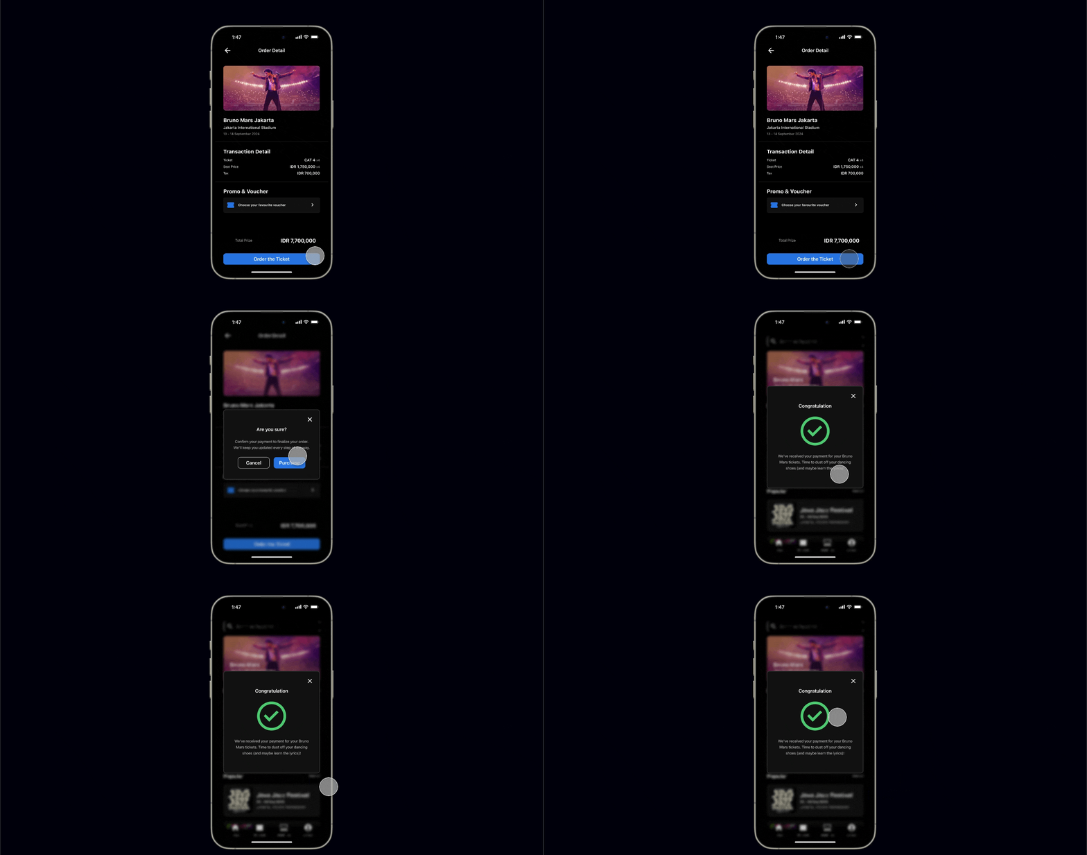
One of the biggest frustrations identified during research was the lack of clarity during critical purchasing moments, especially after payment confirmation.
To reduce uncertainty and improve purchasing confidence, users are provided with clear seat reservation and payment confirmation feedback immediately after checkout.
The interaction pattern was intentionally designed using familiar e-commerce confirmation flows to create a more intuitive and reassuring purchasing experience.
One of the biggest frustrations identified during research was the lack of clarity during critical purchasing moments, especially after payment confirmation.
To reduce uncertainty and improve purchasing confidence, users are provided with clear seat reservation and payment confirmation feedback immediately after checkout.
The interaction pattern was intentionally designed using familiar e-commerce confirmation flows to create a more intuitive and reassuring purchasing experience.
One of the biggest frustrations identified during research was the lack of clarity during critical purchasing moments, especially after payment confirmation.
To reduce uncertainty and improve purchasing confidence, users are provided with clear seat reservation and payment confirmation feedback immediately after checkout.
The interaction pattern was intentionally designed using familiar e-commerce confirmation flows to create a more intuitive and reassuring purchasing experience.
🔒 Dynamic Barcode Protection
🔒 Dynamic Barcode Protection
🔒 Dynamic Barcode Protection
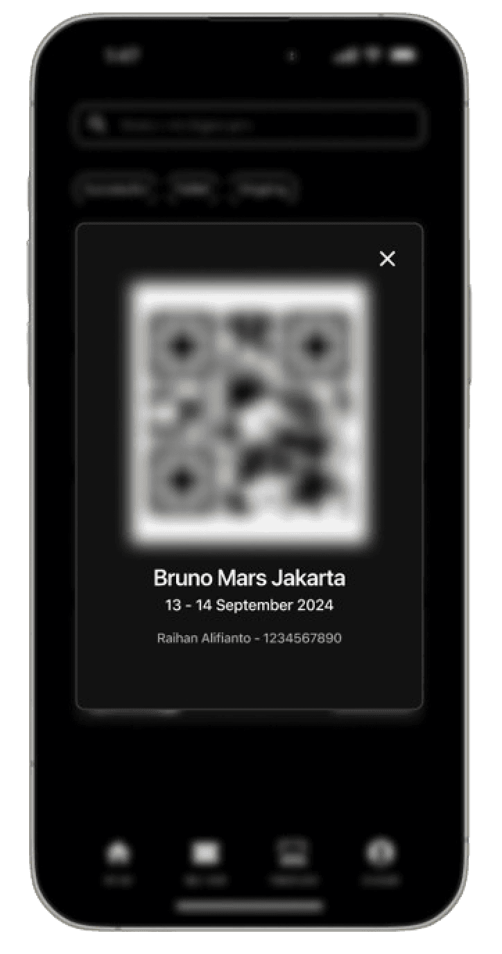
To reduce ticket misuse and scalping activity, the ticket barcode remains blurred until users arrive at the concert venue.
The barcode becomes fully visible only when users are within the authorized event location, helping prevent unauthorized ticket sharing and screenshot-based resale practices commonly used by scalpers before concert day.
To reduce ticket misuse and scalping activity, the ticket barcode remains blurred until users arrive at the concert venue.
The barcode becomes fully visible only when users are within the authorized event location, helping prevent unauthorized ticket sharing and screenshot-based resale practices commonly used by scalpers before concert day.
To reduce ticket misuse and scalping activity, the ticket barcode remains blurred until users arrive at the concert venue.
The barcode becomes fully visible only when users are within the authorized event location, helping prevent unauthorized ticket sharing and screenshot-based resale practices commonly used by scalpers before concert day.
The concept aims to reduce the risk of unauthorized ticket sharing and screenshot-based resale by keeping the barcode protected until event day.
The concept aims to reduce the risk of unauthorized ticket sharing and screenshot-based resale by keeping the barcode protected until event day.
The concept aims to reduce the risk of unauthorized ticket sharing and screenshot-based resale by keeping the barcode protected until event day.

What This Project Revealed
What This Project Revealed
What This Project Revealed
The usability study showed that users were generally able to complete the core ticket purchasing flow successfully while also revealing several areas that still required refinement, particularly around feature clarity and navigation familiarity.
Although the testing was conducted using wireframes, the findings helped validate the overall interaction direction and highlighted opportunities for further iteration in the high-fidelity prototype stage.
The usability study showed that users were generally able to complete the core ticket purchasing flow successfully while also revealing several areas that still required refinement, particularly around feature clarity and navigation familiarity.
Although the testing was conducted using wireframes, the findings helped validate the overall interaction direction and highlighted opportunities for further iteration in the high-fidelity prototype stage.
The usability study showed that users were generally able to complete the core ticket purchasing flow successfully while also revealing several areas that still required refinement, particularly around feature clarity and navigation familiarity.
Although the testing was conducted using wireframes, the findings helped validate the overall interaction direction and highlighted opportunities for further iteration in the high-fidelity prototype stage.
What Changed My Perspective
What Changed My Perspective
What Changed My Perspective
Bias is the worst enemy for UX Designer
Bias is the worst enemy for UX Designer
Bias is the worst enemy for UX Designer
One of the biggest lessons from this project was recognizing how personal assumptions and research bias can influence design decisions throughout the process.
One of the biggest lessons from this project was recognizing how personal assumptions and research bias can influence design decisions throughout the process.
One of the biggest lessons from this project was recognizing how personal assumptions and research bias can influence design decisions throughout the process.
While conducting interviews and usability testing, I realized the importance of staying reflective and continuously validating decisions through user feedback rather than relying solely on initial assumptions.
While conducting interviews and usability testing, I realized the importance of staying reflective and continuously validating decisions through user feedback rather than relying solely on initial assumptions.
While conducting interviews and usability testing, I realized the importance of staying reflective and continuously validating decisions through user feedback rather than relying solely on initial assumptions.
This project also taught me that designing ticket purchasing experiences is not only about speed and functionality, but also about building trust, reducing uncertainty, and supporting users during emotionally high-pressure moments.
This project also taught me that designing ticket purchasing experiences is not only about speed and functionality, but also about building trust, reducing uncertainty, and supporting users during emotionally high-pressure moments.
This project also taught me that designing ticket purchasing experiences is not only about speed and functionality, but also about building trust, reducing uncertainty, and supporting users during emotionally high-pressure moments.
Next Shot
Conduct additional usability testing using the high-fidelity prototype
Refine feature clarity and navigation interactions based on user feedback
Explore additional ticket security and transparency improvements
Continue improving the overall purchasing reassurance experience
Next Shot
Conduct additional usability testing using the high-fidelity prototype
Refine feature clarity and navigation interactions based on user feedback
Explore additional ticket security and transparency improvements
Continue improving the overall purchasing reassurance experience
Next Shot
Conduct additional usability testing using the high-fidelity prototype
Refine feature clarity and navigation interactions based on user feedback
Explore additional ticket security and transparency improvements
Continue improving the overall purchasing reassurance experience

Another Design Shot
Another Design Shot
Another Design Shot